What Your Service Business Website Actually Needs (Not What You Think)
You've seen the websites. Clean fonts, a nice photo of someone smiling in a hard hat or a blazer, a tagline that sounds impressive, testimonials in a neat little carousel. It looks like a real business. Then you check the analytics and the phone hasn't rung in two weeks.
Most advice about service business websites is written by people selling website design, so naturally it focuses on how the website looks. Colour palettes, font pairings, hero image composition. All of that can matter a little. None of it is the actual reason a website does or doesn't bring in clients.
A website's job is to take a stranger from "I found this on Google" to "I just booked a job," in as few confusing steps as possible. Everything else is decoration.
Why a polished site can still get nothing done
A website can look completely professional and still fail at its actual job. This happens constantly, and it's rarely about the design being bad. It's almost always about what happens, or doesn't happen, after someone decides they're interested.
If a visitor has to hunt for a contact method, fill out a generic form that goes into an inbox nobody checks promptly, or call a number during business hours when they found you at 9pm, the website has already lost them. They were interested enough to look. They weren't interested enough to do detective work to become a client.
This is the same gap covered in why your website copy isn't converting, except the problem here isn't always the words on the page. Sometimes the copy is fine and the booking flow underneath it is the part that's broken.
The three things that actually matter
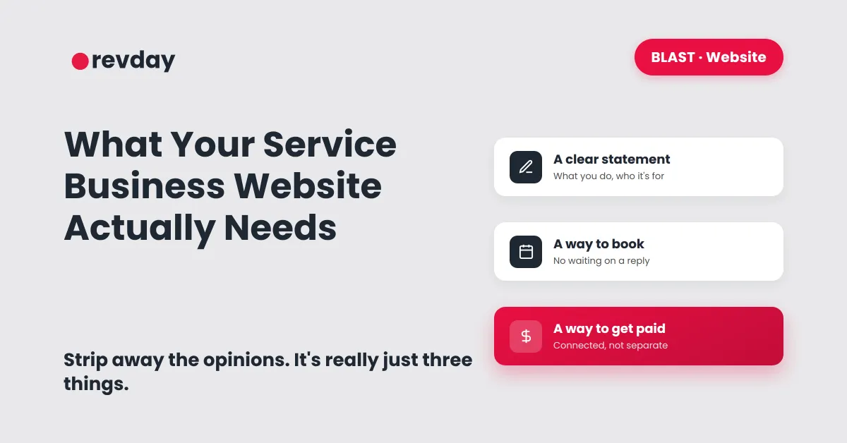
Strip away the design opinions and a service business website needs exactly three things to do its job. Nothing else is required to start booking clients, even if a lot of other things are nice to have eventually.
A clear statement of what you do and who it's for. Not clever, not vague. Specific enough that someone reads it in five seconds and knows whether they're in the right place. This is the foundation covered in getting your minimum viable setup right before building anything more elaborate.
A way to book or enquire that doesn't depend on you replying manually. A calendar link, a simple enquiry form that triggers an immediate next step, or both. The moment someone has to wait for you to personally see a message and respond, you've reintroduced exactly the kind of delay that loses leads.
A way to actually get paid once they're booked. This is where a lot of otherwise decent websites fall down completely. They can capture a lead, but there's no connected path from "interested" to "confirmed and paid."

The booking page matters more than the homepage
Most owners spend the bulk of their time and money on the homepage, since that's the page that feels like "the website." But the homepage's only real job is to convince someone to click through. The page that actually closes the deal is the booking or enquiry page, and it gets a fraction of the attention.
If that page has a slow form, no calendar integration, or asks for ten fields when two would do, you're losing people at the exact moment they were ready to become a client. This is the same logic behind building lead forms that actually convert: the form is doing more commercial work than almost anything else on the site, yet it's usually the page given the least thought.
Pairing that page with a calendar that runs itself instead of a "contact us and we'll get back to you" message closes the gap between interest and booking almost completely.

Do you even need a full website yet
If you're just starting out, a five page website with a blog and an about page and a services page and a contact page is often more than you need, and building all of it can delay you from getting your first client for weeks.

A single page with a clear description of what you do, who it's for, and a working booking link does the actual job a full website would do, just without months of extra build time. The rest of the site can come later, once there's actual client demand to justify it. This mirrors the same staged approach covered in how to get your first clients without overbuilding everything first.
What this changes
None of this is about making the website prettier. It's about making sure the thing visitors actually need to do, see what you offer, decide they want it, and book it, can happen without friction at any step.
A beautiful website that loses people at the booking form has the same revenue impact as no website at all. A plain one page site with a booking link that actually works will outperform it every time.
