The One Page That Matters More Than Your Homepage
Most of the time, effort, and money spent on a service business website goes into the homepage. The hero image, the headline, the layout, the colours. It's the page everyone looks at first, including the business owner, so it gets treated like the most important page on the site.
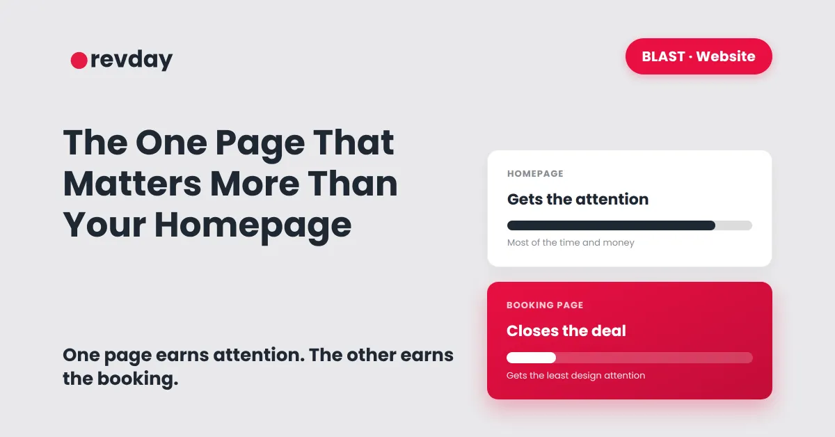
It isn't. The homepage's only real job is to convince someone to click through. The page that actually closes the deal is the one almost nobody spends any time on: the booking or enquiry page. This is one piece of what your service business website actually needs, and it's the piece most often skipped over.
Two different jobs, treated like one
A homepage's job is to make a good first impression and point people in the right direction. It needs to say what you do, who it's for, and give someone a reason to keep going. That's genuinely useful work, but it's not the work that turns a visitor into a client.
The booking page's job is completely different. By the time someone reaches it, they've already decided they're interested. The only question left is whether taking the next step feels easy or annoying. This is the exact moment covered in why a beautiful website still isn't getting you clients: an interested visitor hits a clunky, slow, or confusing booking step and quietly leaves, and the business never finds out why.

Treating these as the same job, or assuming a good homepage automatically means a good booking experience, is how a lot of otherwise solid websites end up with traffic but no bookings.
What actually belongs on a booking page
A booking page doesn't need much. It needs to be fast, clear, and ask for only what's genuinely required to confirm a time.
A direct calendar, not a contact form that promises a reply later. If the calendar runs itself instead of relying on a manual back and forth, the gap between "interested" and "booked" closes almost immediately.
A short, clear list of what happens next. Once someone picks a time, do they get a confirmation? Do they need to pay a deposit? Will someone call them? People book more confidently when they know exactly what's coming.
As few fields as possible if there's a form involved at all. Every extra field is a small reason to abandon the page. This is the same principle behind building lead forms that actually convert: the form on a booking page is doing more commercial work than almost anything else on the site, and it's usually the page given the least design attention.

Why this gets overlooked so often
Nobody opens their own booking page and judges it the way a stranger would. The owner already knows what happens after someone clicks "book," so a slightly clunky form or an unclear confirmation message doesn't register as a problem to them. It only registers to the visitor who's never been through it before and isn't sure if anything actually happened when they hit submit.
This is part of why the booking page is so often the least-considered page on the entire site. The homepage gets reviewed and refined repeatedly because the owner looks at it often. The booking page gets built once and then forgotten, even though it's carrying more of the actual commercial weight.
Put the attention where the job actually happens
None of this means the homepage doesn't matter. It still needs to do its job of explaining what you do and getting someone curious enough to keep going. But once that's sorted, the next round of attention should go to the page that turns curiosity into a confirmed booking, not into another homepage revision.
A polished homepage attached to a clumsy booking page still loses clients. A plain homepage attached to a fast, clear booking flow will usually outperform it.
