How to create high converting landing pages for lead generation
"Be clear, not clever."
- Noah Cohen, revday founder
Creating a landing page that turns visitors into leads is like setting up an inviting shopfront: the clearer, friendlier, and more persuasive it is, the more likely people are to “come in.” Below are five essential steps to design a high-converting landing page that pulls in leads, using revday as your go-to tool at each step.
Listen to podcast:
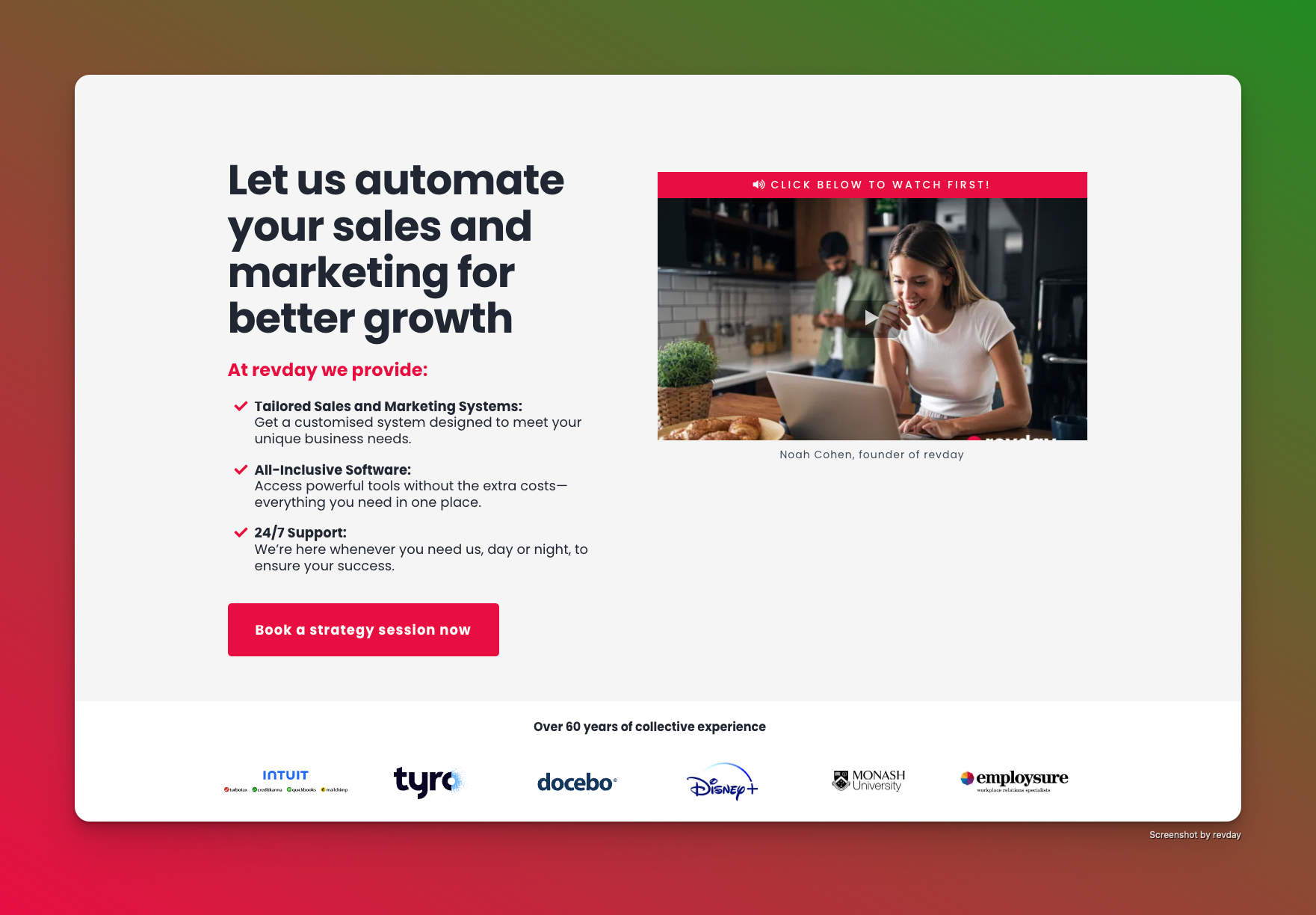
Start with a clear and bold headline in your landing page
Example: revday home page, Hero section.

Think of your headline as your shop’s sign. It should clearly state what visitors can expect. A powerful headline grabs attention and tells people why they’re here. For example, revday lets you test different headlines to see which one keeps visitors engaged. Suppose you’re selling online courses – a headline like “Learn the Skills You Need to Succeed” quickly communicates value.
Eye catching visuals to get more clicks on your landing page
Using high-quality visuals that represent your offer can make a huge difference. revday provides templates with built-in spaces for images, making it easy to showcase your product in action or a happy customer. Imagine you're a freelance designer: show an image of someone excitedly reviewing a newly designed website to give visitors a sense of how you can help them.
Add persuasive copy to increase engagement
Your landing page should explain why someone needs what you’re offering – but keep it short and clear! Describe how your product solves their problem, using bullet points to make it easy to read. With revday’s editor, you can highlight benefits like “Save Time,” “Improve Efficiency,” or “Affordable Prices,” making it clear why your product is a better choice. For example, if you're selling eco-friendly cleaning products, write something like, “Say goodbye to harsh chemicals and protect your home!”
Build trust with testimonials on your landing page
Trust signals, like customer reviews or badges, show that others have benefited from your product or service. revday helps you integrate reviews and trust badges easily. For instance, if you’re a fitness coach, you could feature a short testimonial: “revday helped me gain more clients by building a landing page that highlights my expertise and happy clients.” Trust indicators show visitors they’re making a safe choice.
Tips for building trust with testimonials
• Choose authentic reviews: Select testimonials that genuinely reflect customer experiences to ensure credibility and relatability.
• Highlight specific benefits: Focus on specific outcomes or improvements that clients experienced by using your services, making the testimonials more compelling.
• Use real names and photos: Whenever possible, include the names and photos of clients to humanise the testimonials and increase trustworthiness.
• Showcase diverse perspectives: Feature testimonials from a variety of clients to appeal to different segments of your audience, demonstrating that your service is beneficial to all.
• Integrate trust badges: Incorporate trust badges (like industry certifications or awards) alongside testimonials to enhance credibility and reinforce your brand’s reliability.
Create a strong call to action (CTA)
Your Call to Action (CTA) button is crucial because it encourages people to take action. revday’s platform lets you personalise your CTA, helping it stand out visually and be compelling. Use phrases like “Get Started Today” or “Book Your Free Consultation” to prompt visitors to take the next step. Placing your CTA after the benefits and testimonials ensures that visitors are ready to click, making it easy for them to connect with you.
CTA tips
• Be Clear and Concise: Use straightforward language that leaves no doubt about the action you want visitors to take.
• Incorporate Action-Oriented Language: Choose phrases that encourage immediate action, such as “Get Started Today” or “Claim Your Free Consultation.”
• Make It Visually Distinct: Design your CTA button to stand out using contrasting colors and larger sizes, ensuring it captures attention.
• Position Strategically: Place your CTA after the benefits and testimonials sections to capitalize on visitors’ interest and readiness to engage.
• Test Different Variations: Experiment with various wording, colours, and placements to find the most effective combination that resonates with your audience.
Make it mobile friendly
Most people will view your landing page on their phones, so a mobile-responsive design is essential. With revday’s mobile optimisation, your landing page will look and function great on any device, making it easy for visitors to navigate no matter where they’re viewing it.
By using revday, each step to building your landing page can be quick and effective, making it easier to convert visitors into leads. These tips can help you create a welcoming “digital shopfront” that draws in the right people and encourages them to take action, boosting your business’s success.
